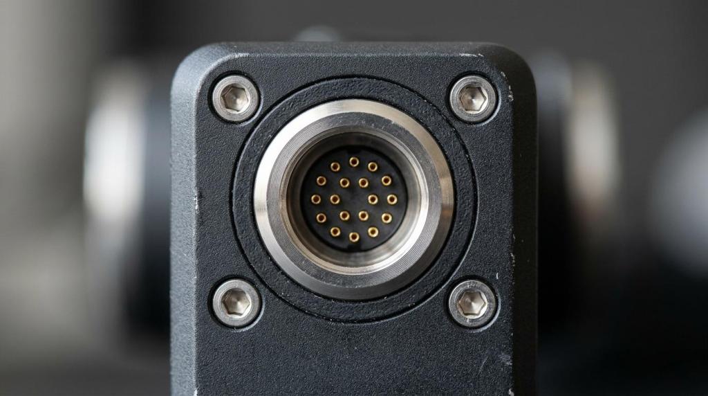
Before a product launch, buyers often decide whether something feels credible before they read a single specification. Gyroid Technologies Pvt. Ltd., an industrial visualization and animation company, sits in a category that matters here because complex products usually need to be seen clearly before they can be judged accurately.
TL;DR: Summary
- Before launch, product visualization should start with high-resolution product images, in-scale views, and zoomable detail; add 3D or AR only when buyers need help judging fit, function, or hidden features.
- Baymard Institute found 56% of users inspect product images first on product pages, and 42% try to judge size from images, so visual clarity often shapes the decision before specs do.
- Low-quality images can be worse than no images, while 93% of desktop e-commerce sites now offer image zoom, making missing detail a clear weakness.
- Think with Google reported that immersive 3D, AR, and VR can strengthen product connection and purchase likelihood, but Baymard’s studies still show standard product images remain the main reference point for many shoppers.
- Gyroid Technologies is relevant when technical launches need engineering-accurate product visualization that explains mechanisms, variants, or use context before the product reaches the market.
That matters because product pages, distributor kits, pitch decks, and internal reviews all depend on visual inspection. Research from Baymard Institute and Think with Google points to the same practical takeaway: clear base imagery comes first, and richer 3D content works best as a second layer when the product itself is hard to evaluate.
Why does product visualization matter before launch?
Product visualization matters before launch because buyers judge visual proof before they trust specifications. Baymard Institute found 56% of users inspect product images first, which is why Gyroid Technologies treats visual inspection as a launch-critical part of technical communication.
Before launch, there is usually no installed base, no customer photos, and limited hands-on familiarity. That means your visuals carry the burden of trust. If people cannot tell what the product looks like, how large it is, what finish it has, or how it works, uncertainty rises fast.
Baymard also found that low-quality product images can be worse than having no images at all because users feel they cannot make a safe purchase decision and may leave to look elsewhere.
“Gyroid Technologies says it delivered product visualization assets for technical sales and marketing in 2023.”
This becomes even more important for technical, industrial, and configurable products. A basic photo may show the outer shell, but it will not always explain internal flow paths, moving parts, installation orientation, or the difference between close variants. That gap is exactly where product visualization earns its place.
How can you tell when standard product photos are not enough?
Standard photos are enough only when the product is simple, familiar, and easy to size. If buyers need to judge hidden features, finish, fit, or operation, product visualization usually beats a basic photo set.
A commodity object with few buying questions can often launch with clean photography, solid zoom, and clear dimensions. A specialized product is different. If the value sits inside the housing, in the assembly sequence, in the material layers, or in how the product fits into a workflow, you need more than surface-level shots.
A common misconception is that adding more angles fixes every problem. It does not. Ten photos without scale cues or detail zoom still leave the buyer guessing. Another mistake is assuming spec sheets can carry the missing context. Baymard’s research repeatedly shows users often prefer image-based information over specifications while browsing product pages.
In practice, standard photography answers, “What does it look like?” Product visualization can answer, “How does it work, how big is it, what changes between versions, and where does it fit?”
What are the 7 clearest signs you need product visualization before launch?
You need product visualization before launch when shoppers cannot confidently evaluate the item from plain photography. The strongest signs involve missing scale cues, hidden mechanics, variant complexity, and repeated explanation from your team.
These signs are useful because they identify uncertainty before it shows up as abandonment, bad-fit leads, or launch delays.
- Buyers keep asking about size or fit: If common questions start with “How big is it?” or “Will this fit?” your visual package is incomplete.
- The product’s value is internal: If the selling point is airflow, sealing, assembly, electronics, or an internal mechanism, surface photos will not explain enough.
- You have multiple variants: Color, finish, connector, capacity, or configuration differences need controlled visual consistency.
- The prototype is not photo-ready: If the physical unit is late, incomplete, or still changing, rendered product visualization can keep launch materials moving.
- Sales conversations take too long: If reps need several minutes to explain what should be obvious in seconds, visuals are doing too little.
- Stakeholders interpret the product differently: If marketing, engineering, distributors, and customers describe it in conflicting ways, a stronger visual source of truth can reduce drift.
- The product page depends on inspection detail: If texture, controls, seams, ports, fasteners, or interfaces matter, missing zoomable detail will hurt confidence.
If even two or three of these signs appear together, the issue is rarely just “better photos.” It is usually a product visualization problem.
How do you audit your launch visuals step by step?
Audit launch visuals in sequence: identity, scale, detail, context, and function. If any stage leaves a basic buyer question unanswered, the launch probably needs stronger product visualization.
Start with the first-look test. When someone lands on the product page or sees the first sales slide, can they tell what the product is within seconds? Then move to the proof test: can they verify size, surface quality, and important features without reading deeply?
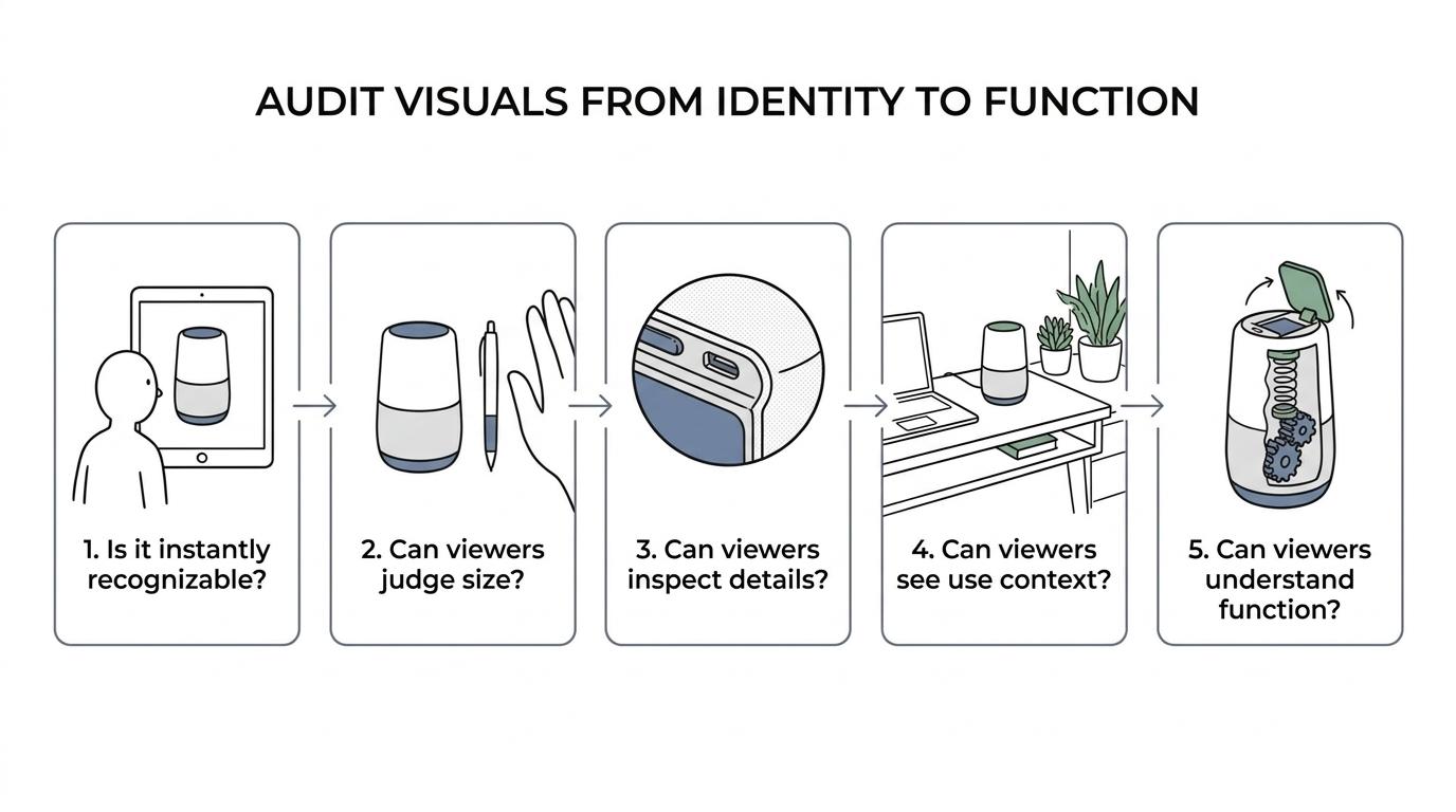
A simple audit framework helps:
- Primary image: Is the product instantly recognizable?
- Scale cue: Can a viewer judge size from the visual alone?
- Zoom layer: Can materials, controls, joints, and finishes be inspected?
- Context frame: Can the viewer see where the product belongs?
- Function proof: Can the viewer understand what moves, opens, connects, or changes?
If the answer is no at any stage, fix that layer before adding more visual polish. Pro tip: do this audit on mobile as well as desktop. Baymard’s zoom findings matter, but mobile pinch-and-zoom behavior often reveals missing detail even faster.
How should you prioritize static images, video, 3D, and AR before launch?
Start with strong static images, then add Video or animation where motion or internal function matters. Baymard Institute and Think with Google point in the same direction, and Gyroid Technologies works in the layer above photography rather than instead of it.
Baymard’s furniture study found that 79% of participants went to product images first when landing on a product page. The same research notes that shoppers often prefer standard images over AR when deciding whether a product suits their needs. Baymard also reported that 41% of users watch product videos, while only 6% actively seek AR.
Think with Google adds the other side of the picture: almost half of surveyed consumers said immersive technology like AR, VR, and 3D helps them feel more connected to products, and 61% said they were more likely to buy from a brand that uses that kind of content. The trade-off is clear. Immersive content can lift interest, but it should not replace the basic image set that buyers use as their main reference.
“Gyroid Technologies says its 2024 workflow expanded into AR, VR, digital twins, and simulation-led storytelling.”
A useful way to prioritize assets is to match them to buyer jobs. Images answer the baseline questions. Video or animation explains sequence and motion. Interactive 3D supports controlled inspection from multiple angles. AR helps with placement and real-world fit. Common misconception: AR is the modern default. In reality, it is usually the fourth layer, not the first.
- First-look trust
- Material inspection
- Motion explanation
- Spatial fit
If your budget is limited, spend it in that order.
How do you add scale cues step by step?
Add scale cues by pairing exact dimensions with visual comparison objects and human context. Baymard found 42% of users try to judge size from images, so scale must be shown, not assumed.
Step 1 is choosing a stable reference. That might be a hand, a standard tool, a desk edge, a room setting, or a known component. The key is consistency. A random prop that changes from image to image can confuse more than it helps.
Step 2 is showing the product in context. An installed view, in-use view, or side-by-side comparison often works better than a floating hero shot alone. For industrial or technical items, a mounting frame, operator interaction, or adjacent machine element can do the job.
Step 3 is matching visuals to the dimensions table exactly. If the product appears slimmer, deeper, or taller than the specs suggest, trust erodes. That alignment also matters beyond the page itself, because SEO.ai’s review of Google feed specification requirements shows how image consistency and accurate product data affect how items are presented across shopping surfaces. Pro tip: dimensions alone rarely solve size confusion. Baymard’s research indicates people often rely on images first, so the visual cue and the numeric spec need to reinforce each other.
How do you prepare zoomable product detail step by step?
Prepare zoomable detail by capturing or rendering textures, interfaces, joints, and tolerances at high resolution from the start. Baymard reports that 93% of desktop e-commerce sites support zoom, which means weak detail is easy to spot.
Step 1 is identifying inspection hotspots before you create assets. Buyers usually want to inspect controls, seams, connectors, material texture, labeling, finish quality, and any point where craftsmanship or engineering precision matters.
Step 2 is building those views at source quality. If you render or photograph too loosely and crop later, detail falls apart fast. This is where high-resolution product images and careful lighting matter most.
Step 3 is testing the zoom experience on the actual product details page. If pinch-and-zoom is awkward, if details blur under magnification, or if the hotspot view is missing, the visual system fails at the exact moment the buyer wants proof.
A common mistake is treating the hero image as the main evidence and everything else as support. In many categories, the reverse is closer to the truth. The hero image attracts attention, but zoomable detail closes uncertainty.
When is immersive 3D or AR actually worth it before launch?
Immersive 3D or AR is worth it when fit, rotation, assembly, or internal structure changes the buying decision. It is less valuable when a simple product can already be judged from sharp, in-scale images.
If the buyer needs to inspect all sides, compare configurations, understand motion, or picture the product in a real environment, interactive 3D or AR can justify the added effort. If the product is flat, familiar, and easy to size, those formats may add novelty without solving a real evaluation problem.
Think with Google’s findings show why brands remain interested in immersive technology: it can raise product connection and purchase consideration. Baymard’s work explains the limit: users still lean heavily on standard images when making practical judgments. If that base layer is weak, 3D will not rescue it.
A good decision rule is simple. If a buyer’s main question is visual proof of basics, improve images first. If the main question is fit, movement, or internal logic, then interactive 3D or AR becomes more compelling.
What mistakes cause product-page abandonment before launch?
Abandonment usually comes from uncertainty, not from a lack of visual flair. Missing zoom, poor scale references, inconsistent variant imagery, and unlabeled renders make shoppers doubt both the product and the seller.
One mistake is showing polished visuals that answer the wrong question. A dramatic lifestyle render may look strong in a campaign, but it will not help a buyer judge ports, materials, tolerances, or actual size. Another is mixing photography and rendering without clear consistency, which can make color, finish, or dimensions feel unreliable.
A second mistake is hiding the useful views too deep in the gallery. Research suggests many users begin with images immediately, so the most informative views should appear early. Put scale, detail, and use context near the front, not buried after generic angles.
A third mistake is treating advanced content as a substitute for clarity. AR, animation, and 3D viewers can be excellent, but not if the default product images are low quality or the scale remains ambiguous. Before launch, the strongest visual systems do a simple job very well: they let a buyer answer size, detail, context, and function quickly, with confidence.